成家 CRISSCROSS
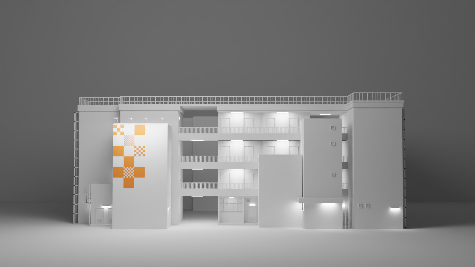
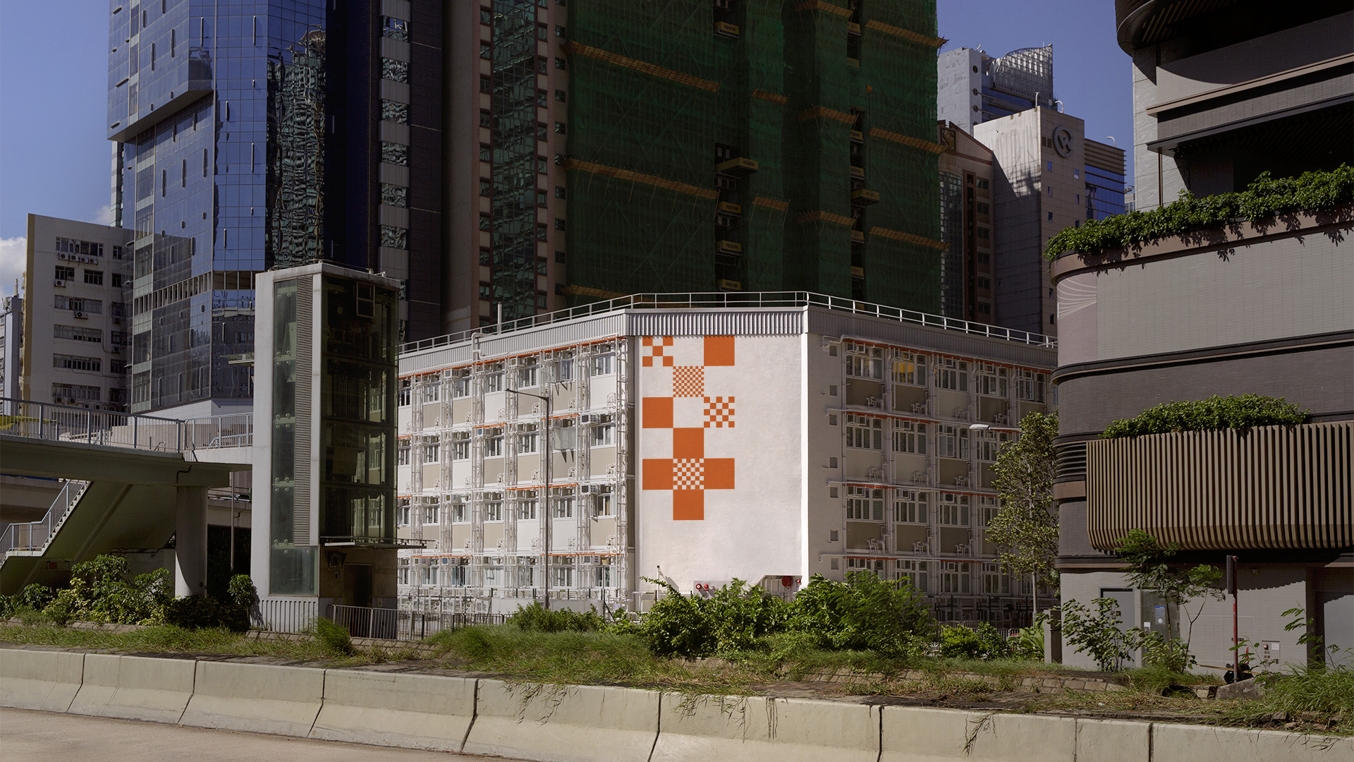
CRISSCROSS, a social housing project established by the Christian Family Service Centre (CFSC), signifies the intersection point for people, families and communities to settle with one accord. CRISSCROSS’s logo comprises a series of boxes in various size assembling, which symbolises how our modular housing enables people having different roots to cross paths and make life choices of their own choosing. Serving as a juncture bridging people and community with compassion, the cross represents both CFSC and the added values we bring for us to thrive together as one.
Task
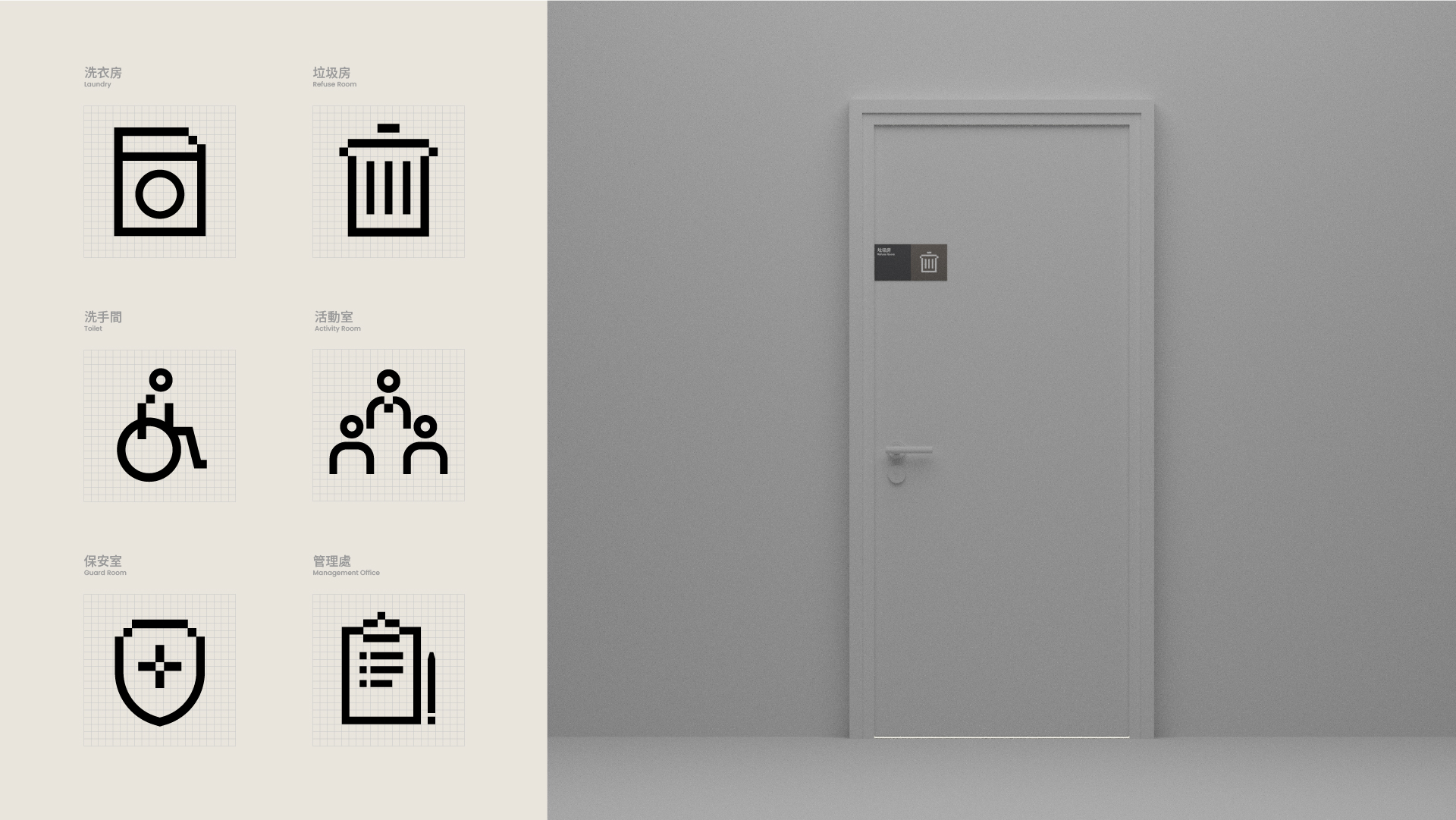
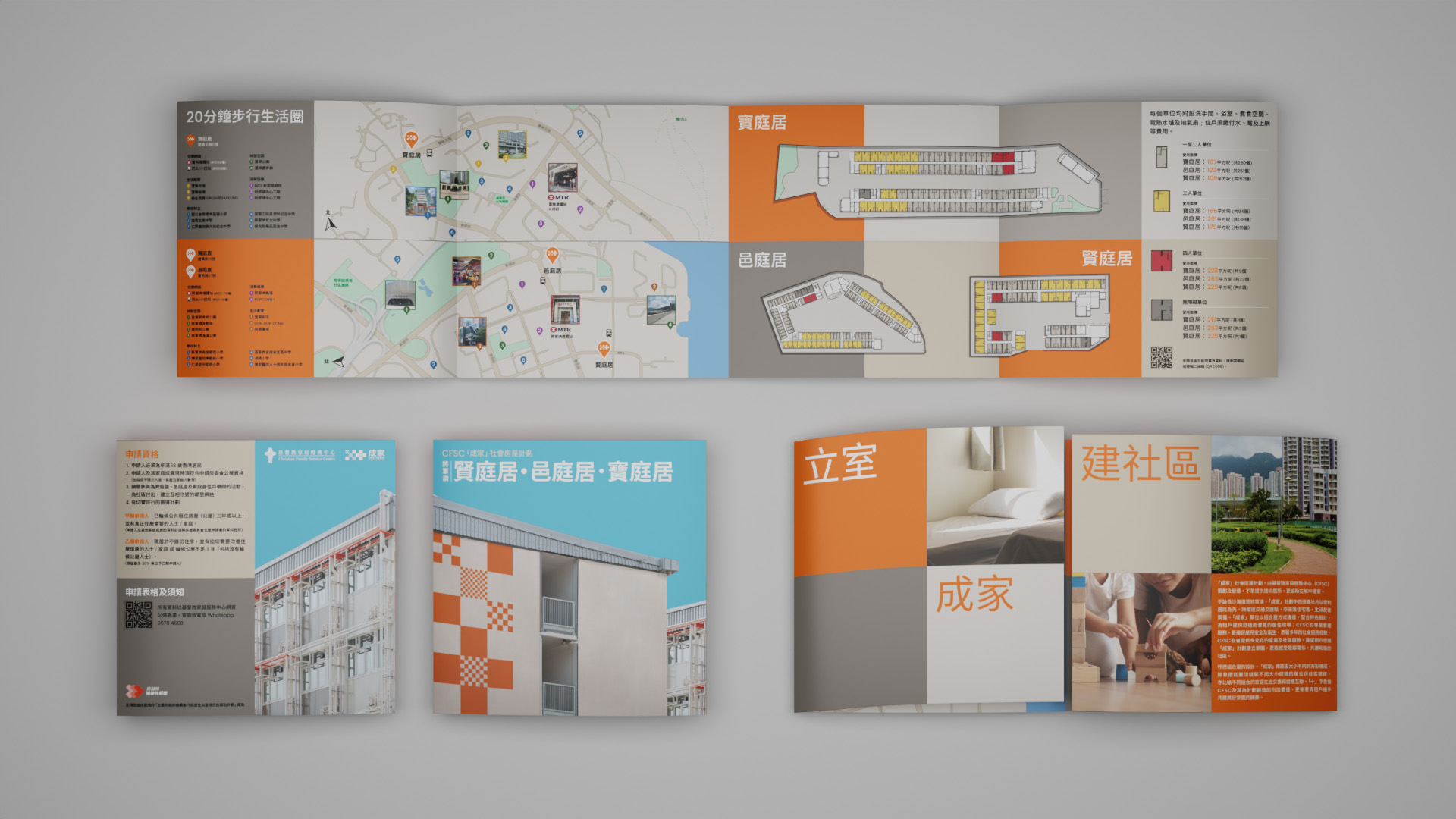
The objective is to devise a visual identity for the brand that captures the essence of modular housing while establishing a connection with individuals, families, and the community as they navigate through life together. This involves implementing the brand's visual elements across various applications such as building graphics, wayfinding systems, and brand materials including brochures.


